← All work
MetLife/Life insurance claims/2025

A life insurance claim that grieving families can finish online.

I designed MetLife's digital Life Beneficiary claim: the path a beneficiary takes from the claim kit in their mailbox to a signed, submitted claim. Until then, filing meant a PDF claim form: one document for every kind of beneficiary. The new flow is shaped around who is filing, what they actually have on hand, and how they want to be paid. For people who'd rather call, a phone-assisted path lets a rep start the claim and hand it off to finish online.

Role
Lead UX designer, engaged through my independent design consultancy. Research, flows, screens, and dev handoff
Partners
Vincent, content strategist, plus product, legal, design system, and engineering
Scope
Self-service and phone-assisted paths, 5 beneficiary types, desktop, tablet, and mobile
Status
Through design system, business, content, and legal review. Dev handoff March 2025
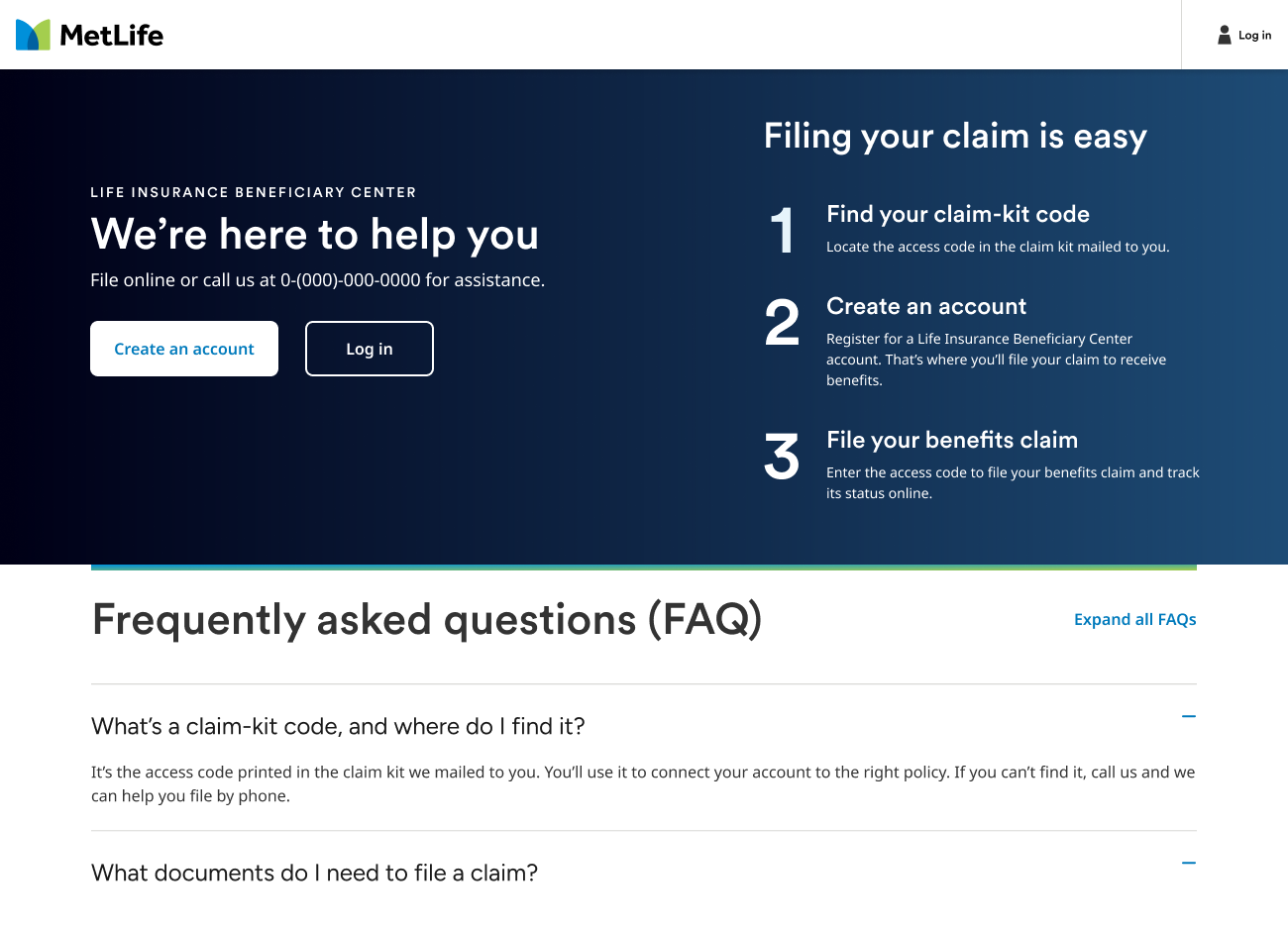
MetLife Life Insurance Beneficiary Center landing page with a three-step explanation of filing a claim and a short FAQ.
01 / The brief

Move the life claim off paper.

  • Give beneficiaries a guided way to file online, starting from the claim kit MetLife mails them.
  • Support everyone who can be a beneficiary: individuals, representatives, estates, trusts, and organizations.
  • Offer a real choice of payment, including MetLife's Total Control Account (TCA).
  • Get every screen through design system, business, content, and legal review before handoff.

The claim was a PDF.

There was no digital intake to redesign. Beneficiaries got a PDF claim form in their claim kit, the same document whether they were a spouse, an executor, a trustee, or a funeral home. It was on them to work out which sections applied and which documents to send, in dense legal language, in the weeks after losing someone. Many called in for help or mailed forms back incomplete, which meant slower payouts and more follow-up for MetLife.

02 / Where the insights came from

Three sources, one picture.

Call logsWhy beneficiaries gave up on the digital path and called in instead
AnalyticsWhere beneficiaries dropped off online before turning to paper or the phone
Usability testsWhere people hesitated, guessed, or asked what a question meant

Each source told part of the story. Together they showed that the hard part wasn't the amount of information. It was working out which parts were meant for you. Testing also surfaced something we didn't expect: people were openly annoyed at how hard the TCA was being pushed.

03 / Who files a claim

Five kinds of beneficiary, five different claims.

An individualFiling for themselves
A representativePower of attorney or guardianship
An estateExecutor or administrator
A trustTrustee acting for the trust
An organizationIncluding charities and funeral homes

Each one needs different details, different proof, and different legal language. A trustee has to upload a certification of trustee. A funeral home files with an assignment. An individual may need neither. One form for all five meant everyone waded through questions that weren't for them.

04 / What we learned, and what we did about it

Four insights that shaped the flow.

01
Truth

Beneficiaries arrive with a claim kit in hand, not a MetLife account.

Action

Start from the kit. A dedicated landing page explains the process in three steps, and the claim-kit access code connects their new account to the right policy. Identity verification is a short, familiar code-by-text or email step.
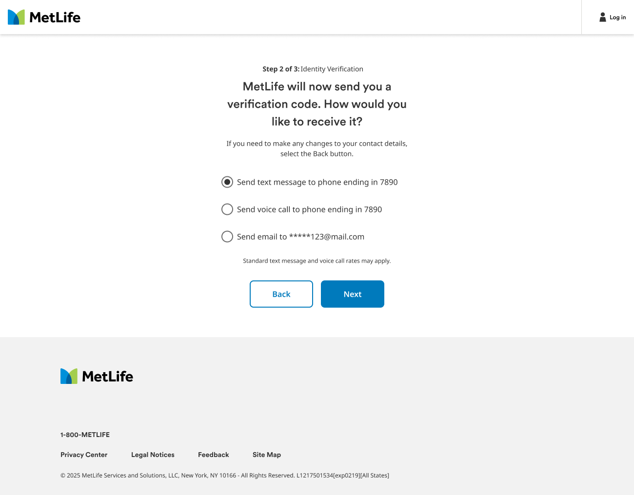
Identity verification step: MetLife sends a verification code by text, voice call, or email.
02
Truth

What someone needs to provide depends entirely on who they are.

Action

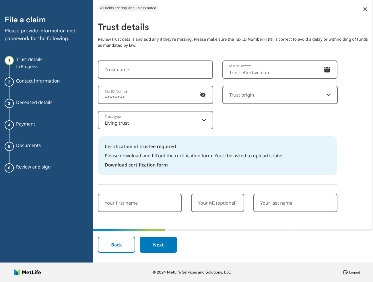
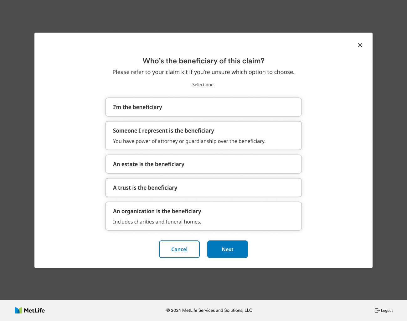
Ask one question first: who's the beneficiary? That answer tailors every step after it, from the details we ask for to the documents we require. A trustee sees trust details and a certification form. An individual never does.

What didn't work first. Our early versions asked everyone the same opening questions and branched later. In testing, estates and trusts worked through several screens of fields that didn't apply to them before the flow adapted. That's what moved role selection to the very first step.

Role selection: Who's the beneficiary of this claim? Options for individual, representative, estate, trust, and organization.
Trust details form with a note that a certification of trustee is required and a link to download it.
03
Truth

A long form feels endless when you can't see where it ends.

Action

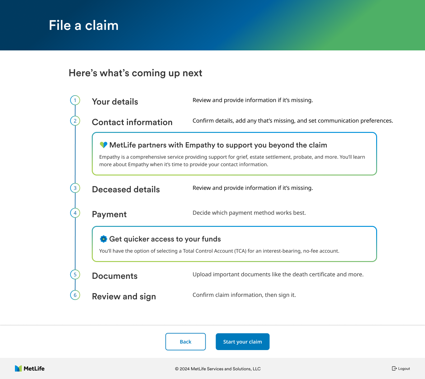
Show the whole path before they start. A "Here's what's coming up next" screen lays out all six steps, and a step tracker stays on screen the entire way. It also previews the two things they'll be offered later, so neither feels like a surprise upsell.

Here's what's coming up next: six steps listed with short descriptions, plus callouts for Empathy support and a Total Control Account.
04
Truth

Almost nobody has every document on day one. Certified death certificates alone can take time to arrive.

Action

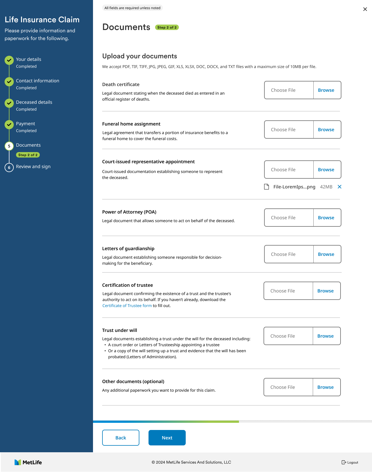
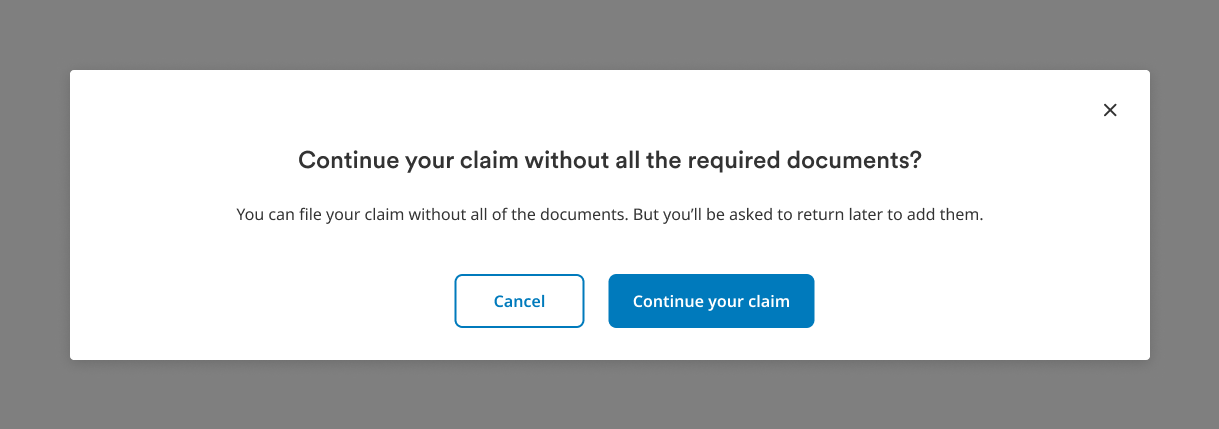
Let people file without everything. The document list is built from their role and earlier answers, and they can continue with what they have and upload the rest later from their dashboard.

Documents step with a tailored list of required uploads, such as death certificate, funeral home assignment, and certification of trustee.
Dialog: Continue your claim without all the required documents? You can file now and come back to add them.
05 / How it evolved

From first sketch to final screen.

Two of the biggest shifts happened between the first wireframes and the final design. Both came straight out of testing.

A

Who's filing

EarlyOne form for every beneficiary, branching later. In testing, estates and trusts worked through fields that weren't theirs.
RevisedOne question up front. The answer decides which details and documents come next.
Final role selection screen with five beneficiary options.
FinalFive plain-language options, with a hint for the two that need explaining.
B

How you get paid

EarlyThe TCA as the default, with other methods tucked away. People in testing felt pushed.
RevisedA side-by-side comparison and an open choice, with other methods one click away.
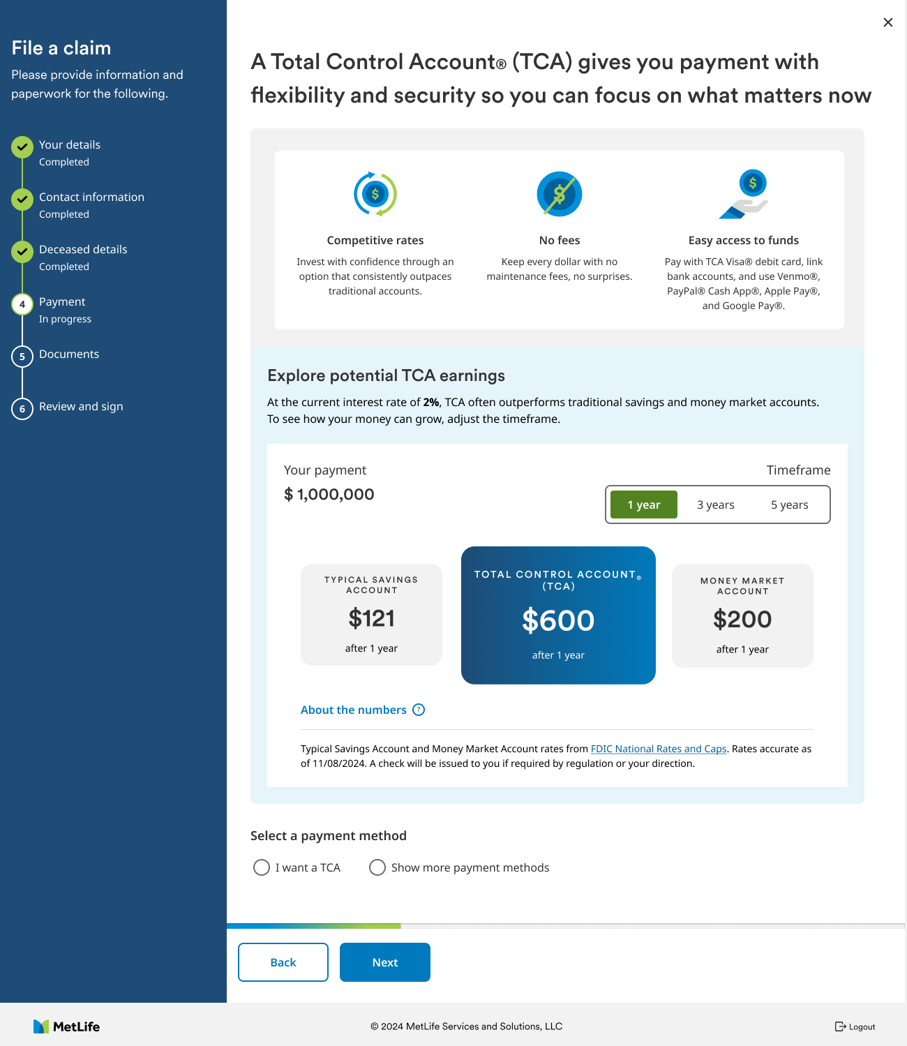
Final payment step with the TCA earnings comparison and payment method choice.
FinalThe TCA featured with real rates and sources, and "show more payment methods" in plain view.

Early and revised wireframes are simplified recreations made for this case study.

06 / The hardest call

Promote the TCA without pushing it.

The business wanted

More beneficiaries choosing a Total Control Account, an interest-bearing account that keeps funds with MetLife. The first ask was to make it the default and hide the other payment options.

Beneficiaries needed

A clear, honest choice about their money at a moment when trust is fragile. Anything that felt like a sales pitch would cost us that trust.

What we did

I pushed back on hiding the alternatives, and the research backed me up: people were already annoyed at how hard the TCA was being pushed. A grieving beneficiary who feels steered on the payment step will start to distrust the whole claim. We landed on making the TCA the featured option and letting the numbers make the case. A side-by-side shows what a payment could earn in a TCA against a typical savings or money market account over one, three, or five years, with the source and date of the rates right there. Other payment methods are one click away, not buried. The same choice appears up front on the "coming up next" screen, so it never feels sprung on anyone.

Payment step: A Total Control Account gives you payment with flexibility and security, with an earnings comparison against savings and money market accounts and an option to show more payment methods.
07 / Care and compliance

Support beyond the claim, and legal language people can follow.

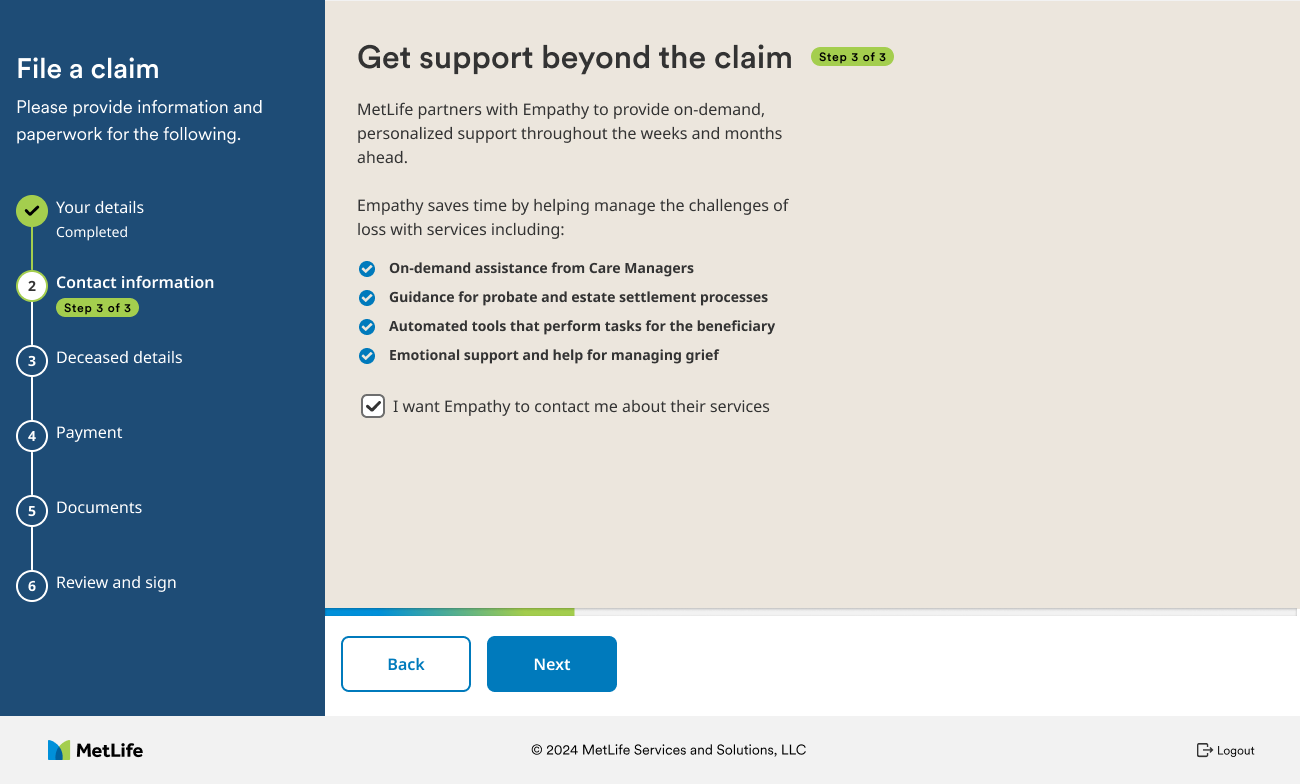
Get support beyond the claim: an opt-in for Empathy, which offers care managers, estate guidance, and grief support.

An opt-in, not an interruption

MetLife partners with Empathy for grief and estate support. We placed the offer inside the contact step as a single, clearly worded checkbox, so help is easy to accept and just as easy to skip.

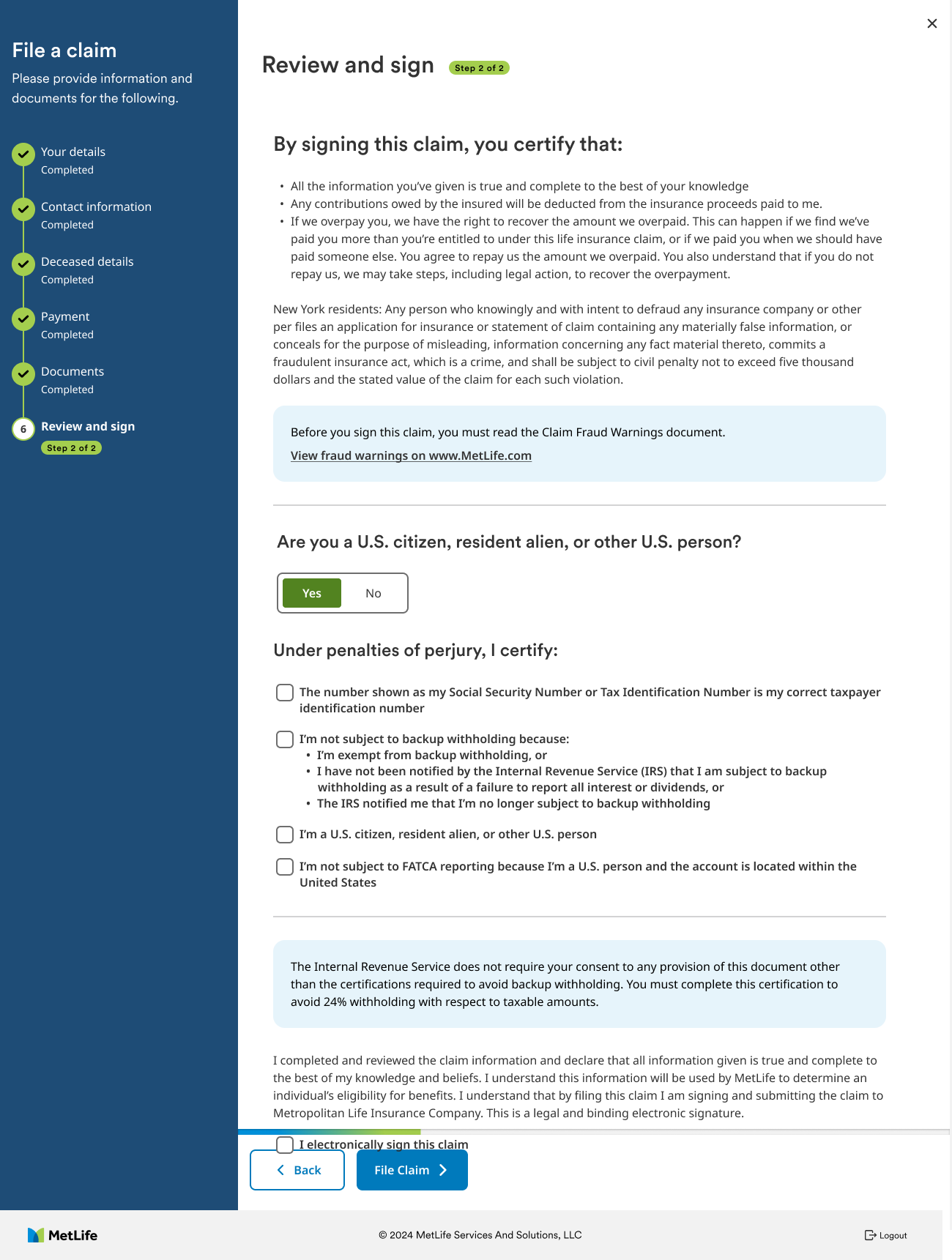
Review and sign: certifications, fraud warning notice, U.S. person question, and tax certifications before an electronic signature.

Required language, broken into decisions

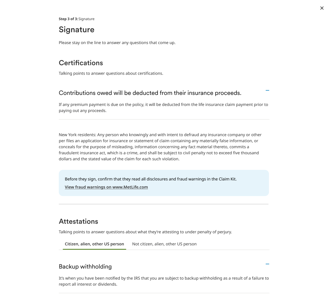
The signature step carries certifications, state fraud warnings, and IRS tax language that legal requires word for word. We couldn't shorten it, so we structured it: one plain question at a time, notices set apart, and the signature as a single final action.

08 / The unhappy paths

Designing for the moment things go wrong.

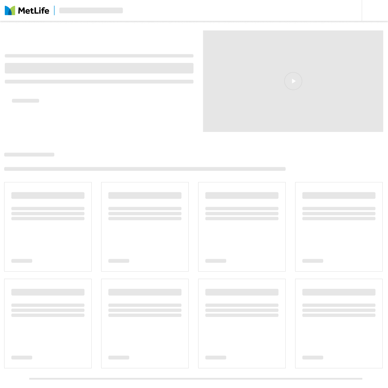
People file these claims in short bursts, between calls and appointments. So we designed the interruptions as carefully as the main flow: warning before a security timeout and saving their work, offering to save a draft when they leave, and loading skeletons that show the page's shape instead of a blank screen.

Still there? For security, you'll be logged out in 1 minute 55 seconds. Anything you're working on will be saved.
Timeout warning, with work saved
Save your claim as a draft? Or keep working on it?
Save as draft when leaving
Skeleton loading state for the claims dashboard.
Skeleton loading state
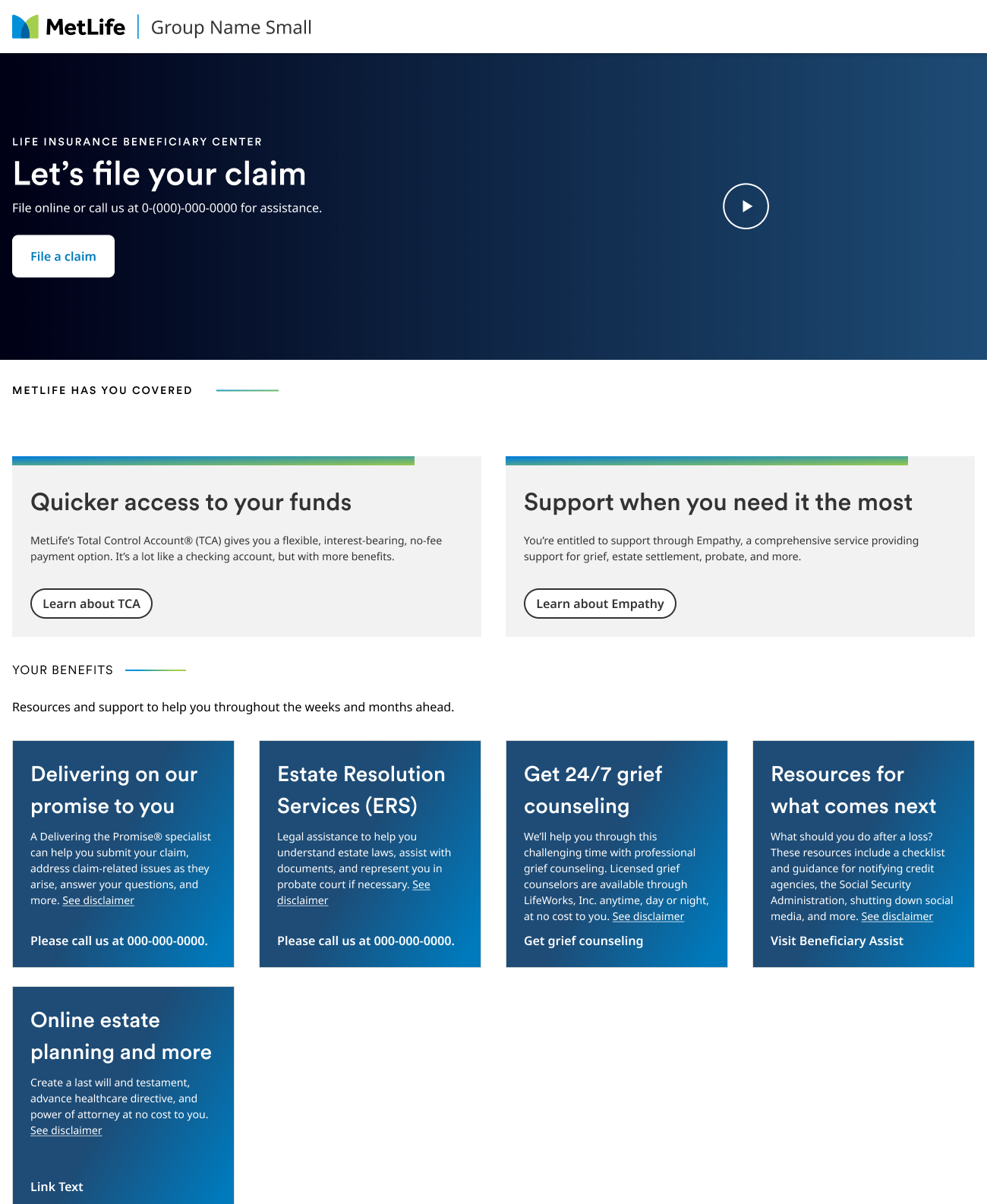
Logged-in dashboard: Let's file your claim, with cards for TCA, Empathy, and other beneficiary resources.
Dashboard to come back to
09 / The phone path

For people who'd rather talk to someone.

Some beneficiaries can't or don't want to file online. They call instead, and before this, a call usually ended with a PDF in the mail. With Vincent, I designed a telephonic intake that pairs a call center rep with the same digital claim. The rep starts the claim on the call, then hands it to the beneficiary to review, add documents, and sign on their own device.

On the callCall center rep
  1. 1Find the beneficiary
  2. 2Capture the claim together
  3. 3Send a secure link
After the callBeneficiary, on their own device
  1. 4Verify identity
  2. 5Review what was captured
  3. 6Upload documents
  4. 7Sign and submit
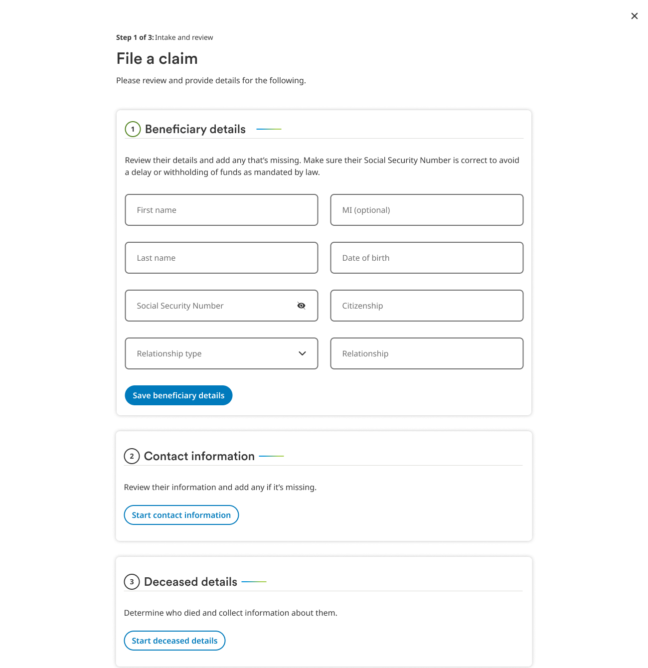
Rep view of File a claim: step 1 of 3, with beneficiary details, contact information, and deceased details sections filled in with the caller.
01
Truth

Callers don't always have their claim number in front of them.

Action

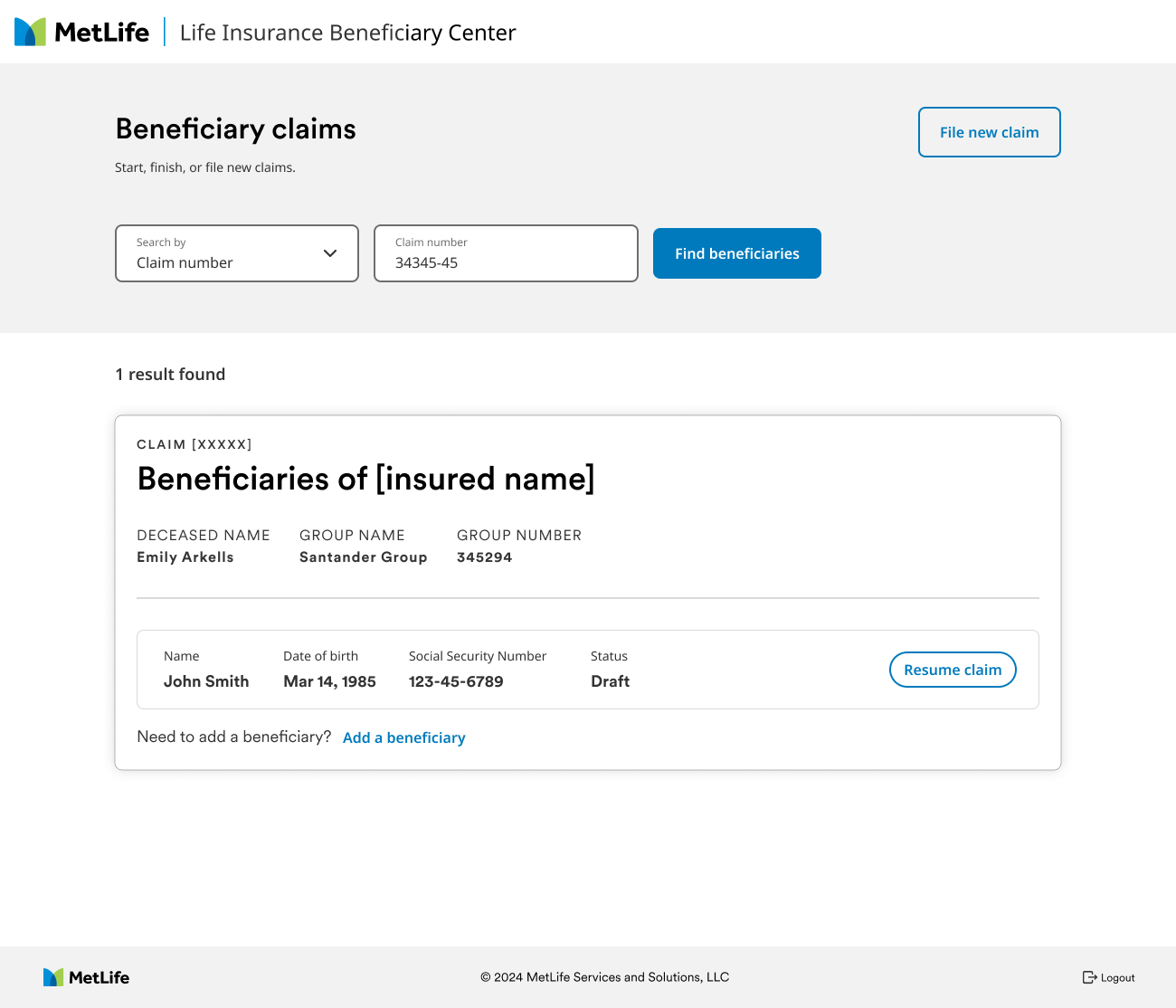
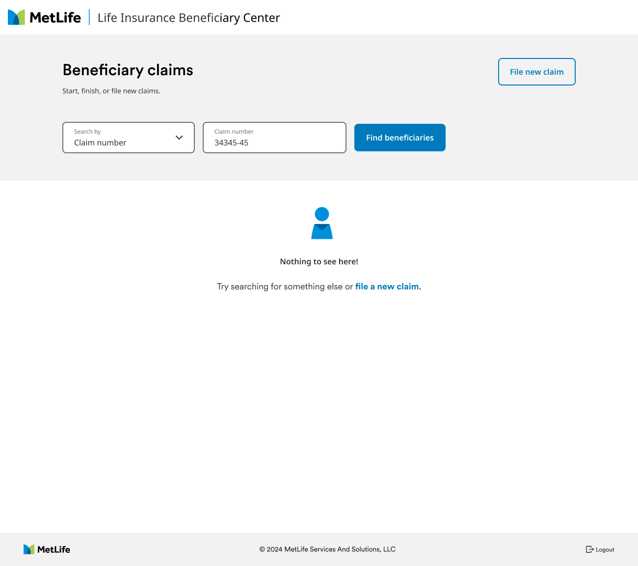
Let the rep search three ways: by claim number, by Social Security number or TIN, or by name and date of birth. When nothing matches, the rep sees it right away and can start a new claim from the same screen.

Beneficiary claims search by claim number, showing one matching claim with the beneficiary's details and a Resume claim button.
No results state with a link to file a new claim.
02
Truth

Reps have to cover required language word for word and still sound like a person.

Action

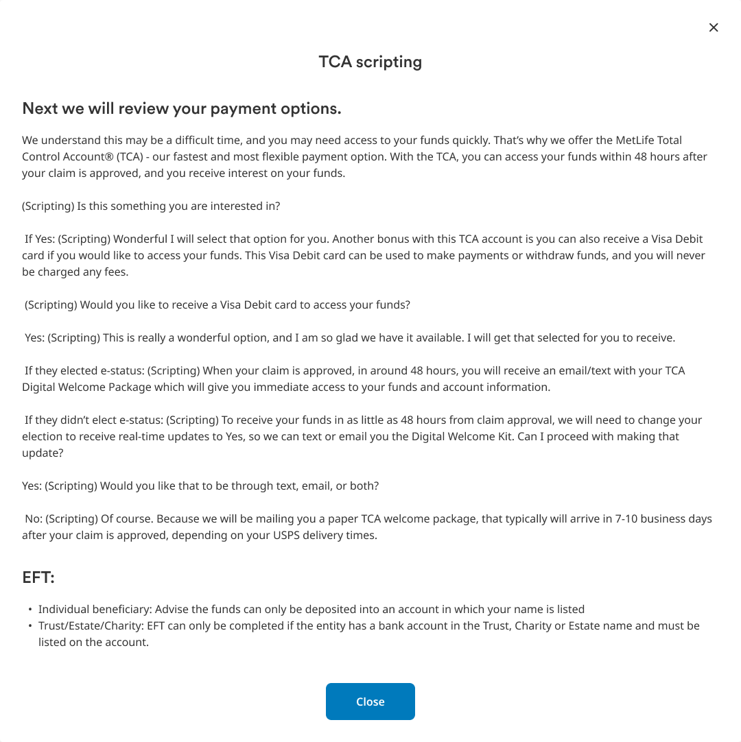
Put the script where the rep needs it. Payment options, including the TCA, come with scripting that walks through every choice, and the signature step carries talking points for the certifications. The rep never has to leave the claim to find what to say.

TCA scripting panel for the rep, with the exact words for reviewing payment options.
Rep signature step with talking points for certifications and attestations.
03
Truth

A beneficiary shouldn't have to type what they just said on the phone.

Action

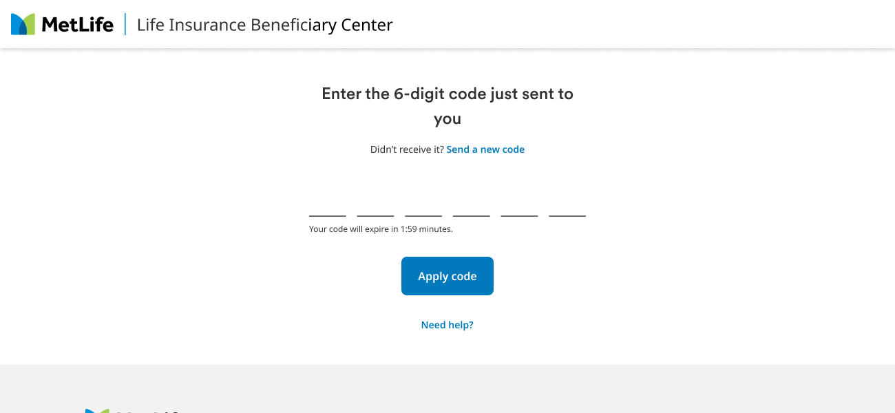
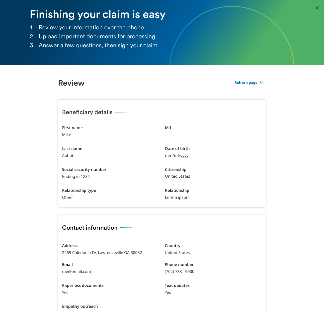
Make it a handoff, not a restart. The rep sends a secure link by text or email. The beneficiary verifies with a one-time code, then reviews the details already captured, so all that's left is documents and a signature.

Send link to claimant dialog with the beneficiary's phone number and email.
Beneficiary identity verification: enter the 6-digit code just sent to you.
Finishing your claim is easy: a three-step summary, then a review of the beneficiary details the rep captured.
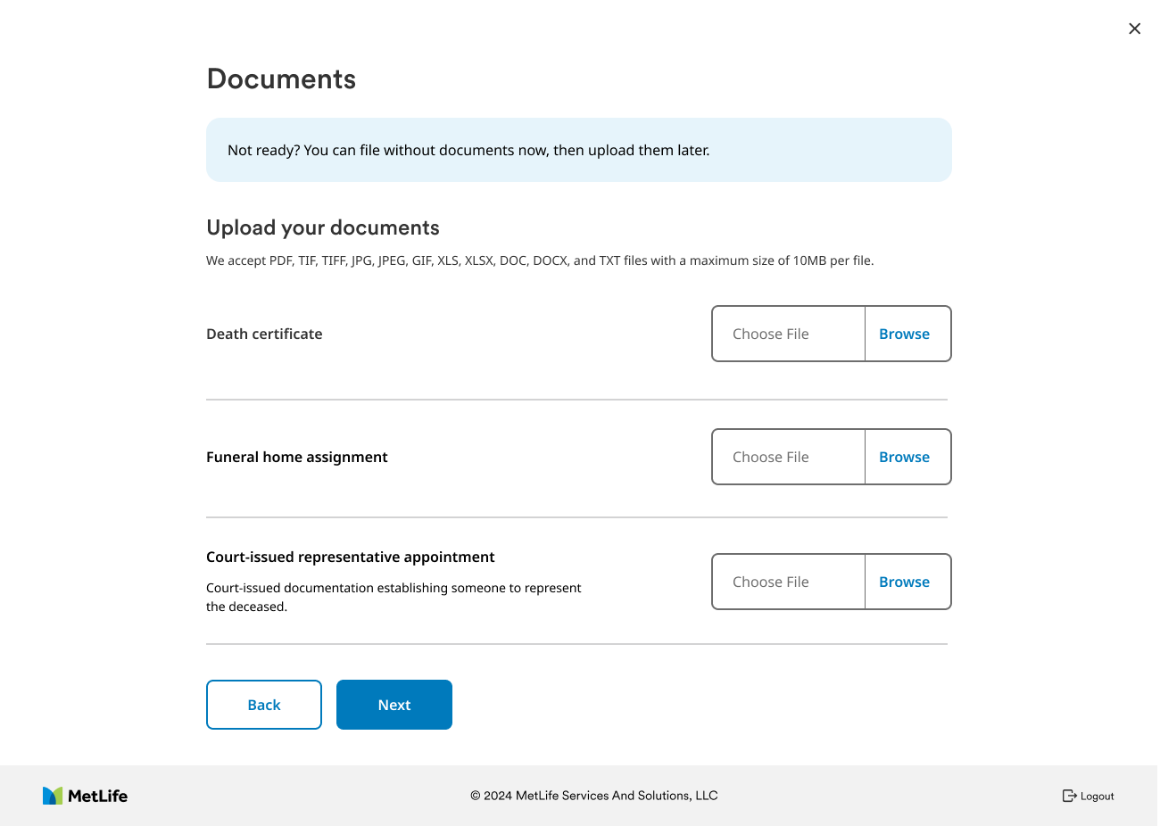
Beneficiary document upload, with a note that they can file without documents now and upload later.
Documents, with the option to add them later
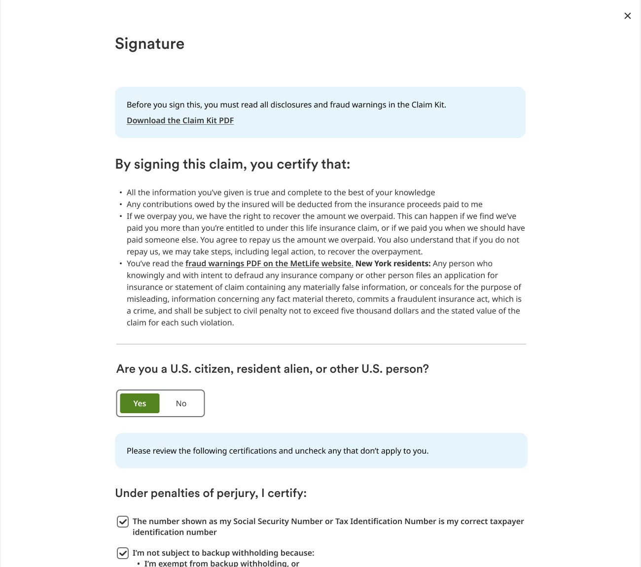
Beneficiary signature step with disclosures and certifications.
Certifications and e-signature
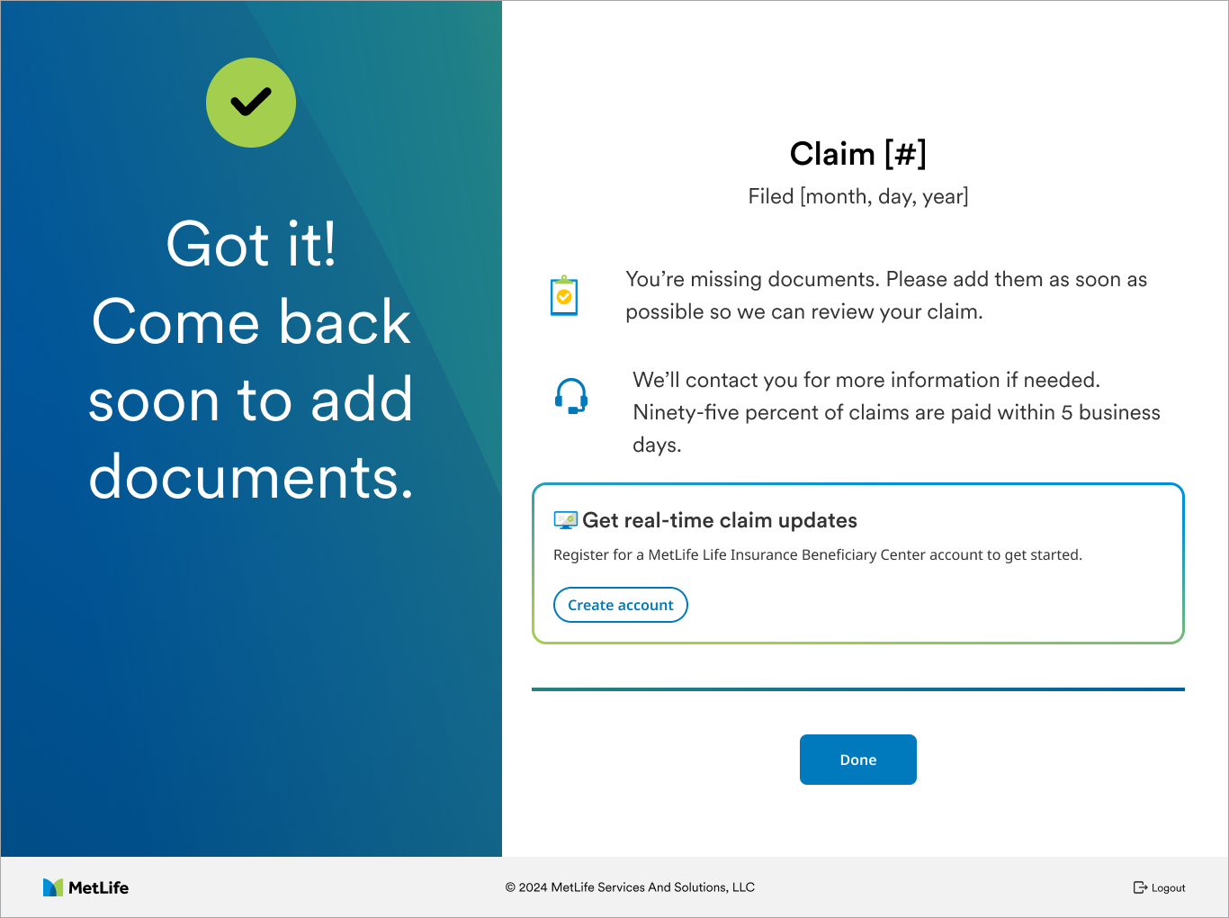
Success: Got it! Come back soon to add documents, with an option to create an account for real-time claim updates.
Filed, with a nudge to finish documents
10 / Getting it through

Every screen, four sign-offs.

In a regulated flow, a design isn't done when it looks right. Each step had its own cover page with its use case and an approval trail, so reviewers could sign off step by step instead of all at once.

  1. Design system reviewComponents and patterns match MetLife's system
  2. BusinessClaims operations and product sign-off
  3. ContentPlain language, consistent terms
  4. LegalCertifications, disclosures, and state requirements
  5. Dev handoffSpecs for desktop, tablet, and mobile
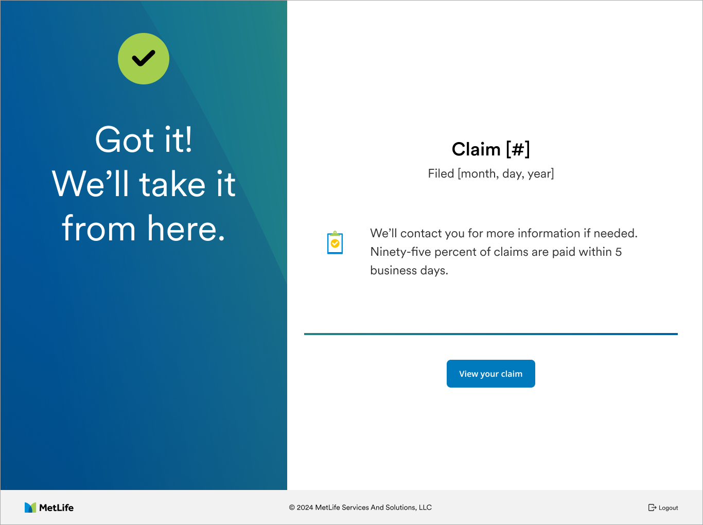
Success screen: Got it! We'll take it from here. Claim filed, with a note that MetLife will reach out if more information is needed.
11 / What it was built to move

Fewer paper claims, faster payouts.

  • Beneficiaries filing online instead of mailing back a PDF
  • More complete submissions on the first try, so fewer follow-ups
  • Higher TCA adoption, through an honest comparison instead of a hard sell
  • One clear place for beneficiaries to check status and finish what's left
  • A phone path that ends in a filed claim, not a mailed PDF

Results are still being measured. I'll update this page with the numbers once they're in.

12 / Looking back

What I'd carry forward.

Ask the one question that changes everything first. Role selection did more to shorten this flow than any field-level cleanup could.

Pair with content from day one. Working side by side with Vincent meant the plain-language choices and the layout were decided together, not patched in after review.

Treat legal as a design partner. Bringing legal into review early meant the required language shaped the layout from the start instead of breaking it at the end.

Next up: the multi-claim status page, for beneficiaries of more than one policy, was still being explored when this work was handed off.